Chaos Contained: Hallaton Web Design
[su_row][su_column size=”1/2″]
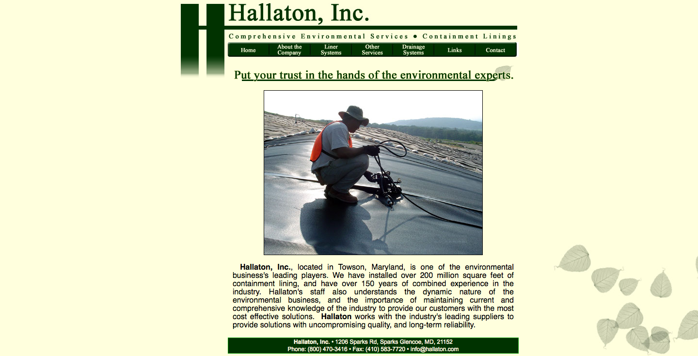
For our client Hallaton—a company that installs containment lining for landfills, excavations, and similar purposes—we wanted to contain the chaos of diverse elements into a web design that integrated their very identity.
[/su_column]
[su_column size=”1/2″]
[/su_column]
[/su_row]
The H Word
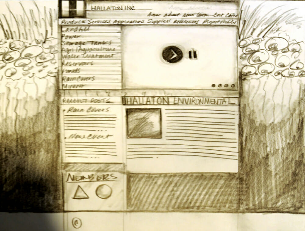
It began with a sketch. Strong vertical layers of soil framed “containers” of text to depict both literally and figuratively what Hallaton does. But the integration of containment and creativity had its finest moment when a horizontal bar connected the verticals into an H. The design of the home page now echoed the identity of the client. The logo became the design.
Earth Colors
Now that we had our structure, the next challenge was to choose identity-rich colors. The greens and blues of nature represent Hallaton’s commitment to protect the earth. The black design elements communicate power and strength.
Talking through Type
Fonts, too, have the power to reinforce a company’s identity and tell its story. These fonts possess strength and balance in their block-like structure, yet they are sleek and modern in their aesthetic. We used uppercase type to draw the eye to headers, menus, and page titles for user-friendly navigation.
Out of the Container
Good web design is a balance of creating containers and breaking boundaries. The site went live today. Let us know what you think.