
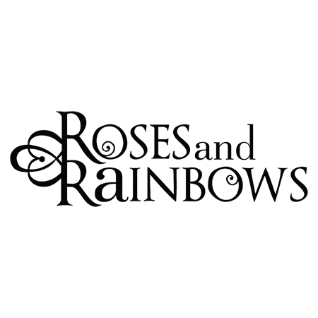
Kim’s original logo was created when her non-profit was newly formed. Once women had gathered in Kim’s living room for talk, study, and encouragement; now they were gathering across the United States in homes, churches, and offices. Once Kim had spread her message with weekly emails; now she had published several books and booklets and was in the process of digitizing her curriculum series for U.S. distribution. This organization had indeed grown up.
That’s Not Me!
But its logo had not. It had a Barbie-look about it that didn’t match our client, who radiated elegance, warmth, and authenticity. Neither did it match the women serving alongside Kim. These were active, roll-up-your-sleeves, get-real women. Kim needed a logo that was true to herself and the people she was reaching.
Surprised by Strength
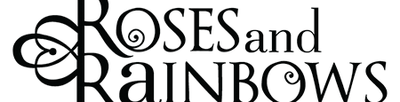
The name of Kim’s ministry—Roses and Rainbows—was soft and girly. Yet Kim’s core message was anything but. She helped women move from shame and defeat to strength and confidence. We decided to capture that transformation with strong typography. Then we tempered the strength a notch by playing with opposites: upper case versus lower case letters, strong type versus delicate filigree.
Not Every Picture Tells a Story
Words like roses and rainbows almost demand to be illustrated. We had to ask, “What will a picture of a rose or a rainbow add to the message of the logo?” The answer was, “Nothing.” The words alone get the job done. The filigree subtly mimics roses without overcomplicating the logo. Simplicity wins the day.
But Can It Scale?
Logos today are never used in just one medium and just one size. An effective logo must look good on letterhead and business cards, in a web banner, on video, on social media, and more. An aspect of creating a more mature, sophisticated logo was to ensure it worked in different sizes, different applications, and different colors (black and white, for instance). It seemed to us that if Kim could do it all, then her logo needed to be able to do it all too!
A Logo for All Seasons
Our client had outgrown one logo. We didn’t want her to outgrow this new one for a long, long time. By creating a logo that is true in tone and style to Kim’s essence, and by keeping it simple and versatile, we gave her a logo almost as timeless as her message.
The original logo
The new logo reflects a mature, more confident sense of identity.